Drawing Strategy (for Platform Ops)
My journey into Wardley maps
Where are we going?
I think that’s the main question that a good strategy should answer. But it's hard to answer without knowing:
Where are we now?
How well are we positioned against other forces in our environment?
What are the impediments that block us from achieving our target?
If we don’t answer these questions, our desired direction may just be wishful thinking. But if we do answer them, it can actually change the direction or path we follow.
Simon Wardley introduced his strategy visualization technique in 2005. If you’ve never heard of Wardley maps before, I think this video is the shortest introduction. If you have more time, I recommend reading Simon’s book (it’s free).
As he writes in the book:
… six absolute basic elements for any map which are visual representation, context specific, position of components relative to some form of anchor and movement of those components.
The first map I drew was related to my attempts to make sense of IT systems involved in payroll and invoicing. It’s not perfect, but it helped me start searching in the right direction.
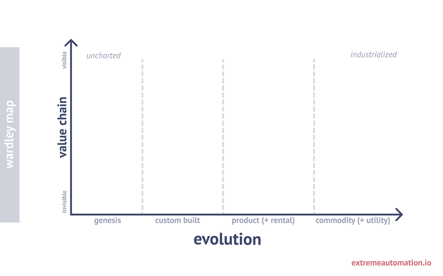
The X-axis represents the evolutionary phase of components involved in the system/organization — starting on the left with “nobody has ever done this before” and ending on the right with fully industrialized experience. Imagine the electricity in 1800s and in 2000s as an example.
The Y-axis shows visibility/value of the component to the actor we are mapping for. If we use electricity analogy, a lamp is super high on the value chain for the customer, but industrial transformer (despite being an important bit of infrastructure) is way lower.
The main trick that makes a map powerful is that moving elements around will change the meaning of the map. That’s a vast difference from a simple diagram.
Platform Engineering
A topic close to my heart is platform engineering. Creating the rails that help companies deliver changes to business applications is what I do for a living.
Let’s use this as a playground for a mapping experiment.
Empty canvas
Of course, we always start with an empty canvas.
Who’s the customer?
The first thing we need to understand is who the users are that we’re building for. In this case, the beneficiaries are the developers.
We could probably add other stakeholders, but doing so might introduce too much detail into the map.
What are the most visible elements?
The next step is to determine the touchpoints.
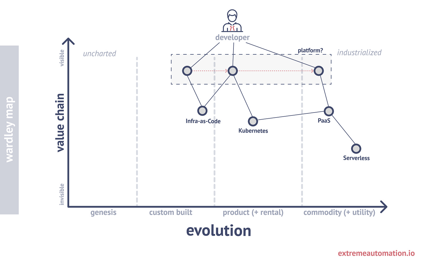
Let’s assume that we know our developers interact with the platform through different interfaces:
Custom-built UIs (e.g., development environment status page)
Preconfigured products (e.g., Kubernetes cluster)
Cloud services (e.g., AWS CloudWatch)
Let’s represent this by placing abstract platform elements on different evolutionary phases:
The red arrows on the map above indicate the platform team’s overall desire to move from custom-built elements to “as-a-service” offerings where possible. This shift alone can foster interesting discussions among team members.
Down the rabbit hole
We can denote that the platform team treats the composition of platform interfaces as a single entity by drawing a rectangle around them. It’s a minor detail, but it can help guide the discussion.
Next, we add more building blocks that support the touchpoints.
Context is always important. Let’s imagine that we’re drawing this map for internal process improvement discussions. This context will require us to plot more lower-level dependencies as well as our desired state on the map.
Note that the distances between:
in-house Kubernetes cluster and managed Kubernetes cluster
custom GitOps flows and Argo CD integration
These distances may represent the team’s perception of how long it might take to transform from one state to another. The red block indicates an impediment on the path to the desired state. These impediments could include:
Internal politics
Lack of certain skills within the team
Important business requirements that cannot be met
Higher cost of ownership
These obstacles can be added as notes to the map or might naturally emerge as discussion topics during the drawing session.
Is it really what customer wants?
Drawing the first version of the map may lead to a series of questions:
Do developers really need a platform?
Does the term “platform” too broadly define the overall direction?
What’s higher up in the developer’s value chain?
Let’s imagine that what our developers need most are self-service environments. This is crucial because they frequently need to verify deployments in pull requests and experiment with new functional features.
In light of this, let’s set aside the first map and draw a new one with a more focused context.
Into the abyss
The current state discovery process might lead us to this map:
The most valuable piece of our platform is a custom AngularJS application running on a manually configured virtual machine, set up several years ago. The reason it hasn’t been migrated to a productized Kubernetes cluster is simply due to a lack of time and the “if it works, don’t touch it” mentality.
Another potential conclusion we might reach as we continue mapping is that the world around us has changed. There are now many simple ways to create per pull-request environments that integrate well with the Git ecosystem and chat tools. These modern tools are well-known and can fully replace custom-built components.
The beauty of mapping lies in its ability to capture the details of your internal state and the state of the world around you, enabling you to make informed decisions.
At this point, we can set aside the current map and start drawing another one.
Summary
What I’ve learned through experimentation:
Mapping is an iterative process.
Version one will never reveal everything.
Draw a map. Discuss it. Discard it. Repeat.
The purpose of mapping is not the map itself — it’s the discussions that happen around it.


